Brand Identity
Ember & Root
A botanical-inspired identity shaped around everyday rituals, natural forms, and a warm, grounded visual language.
Project Overview
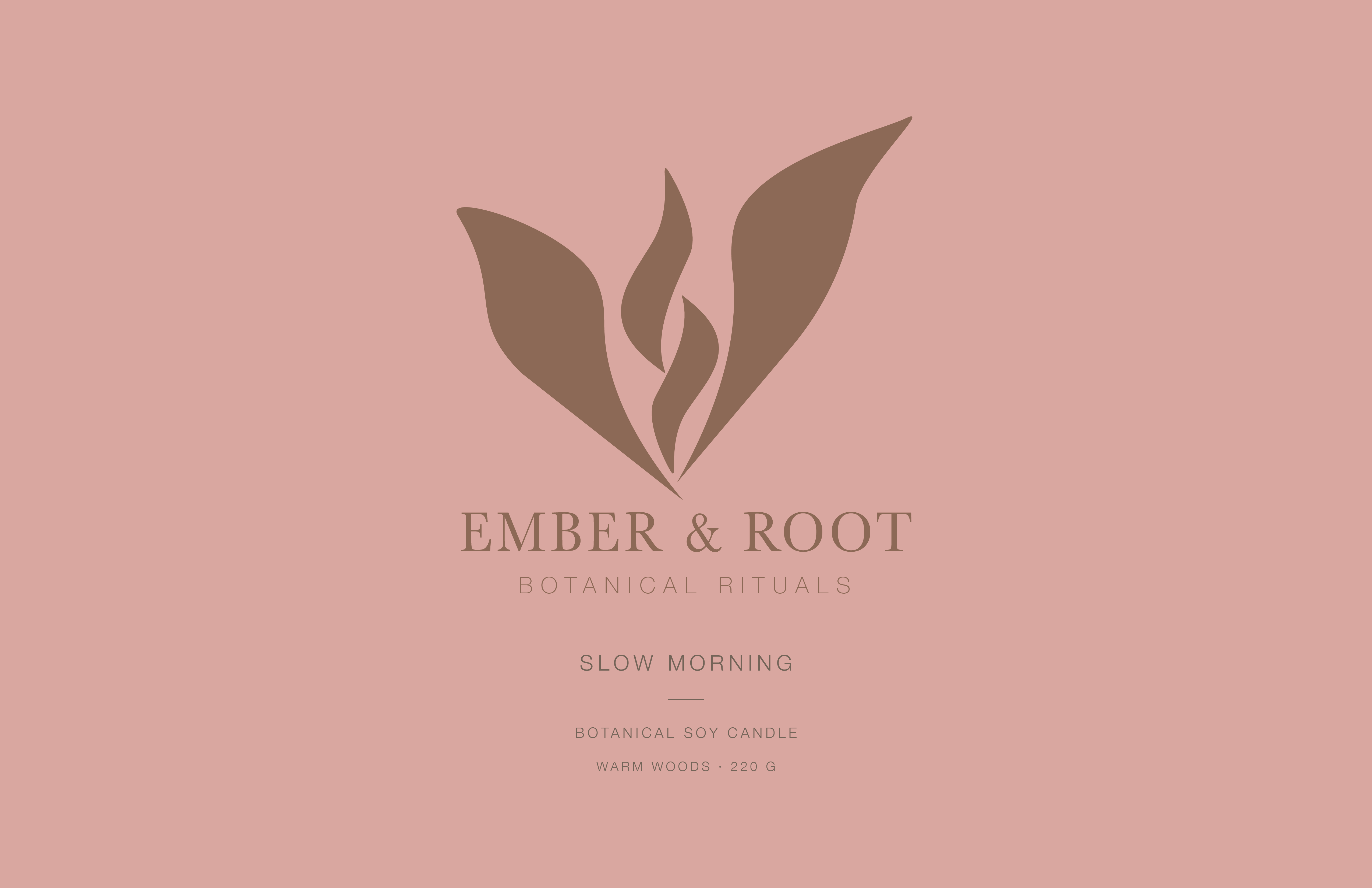
Ember & Root is a botanical-inspired brand identity concept developed through a logo system, a warm natural color palette, and product and packaging applications.
The visual direction pairs a stylized botanical mark with a refined wordmark. Cream, terracotta, rose, brown, and sage tones carry the identity across the supplied product and packaging mockups.
Project Brief
01 / OBJECTIVEDevelop an original countershape logo that strengthens the Ember & Root brand identity through thoughtful use of positive and negative space.
Using Adobe Illustrator, create a distinctive logo through advanced Pathfinder techniques, intentional composition, and vector design. Apply the identity across four or more brand mockups to demonstrate consistency, versatility, and professional presentation. The final composition is arranged on an 11 x 17 inch artboard.
Visual Identity
02 / LOGO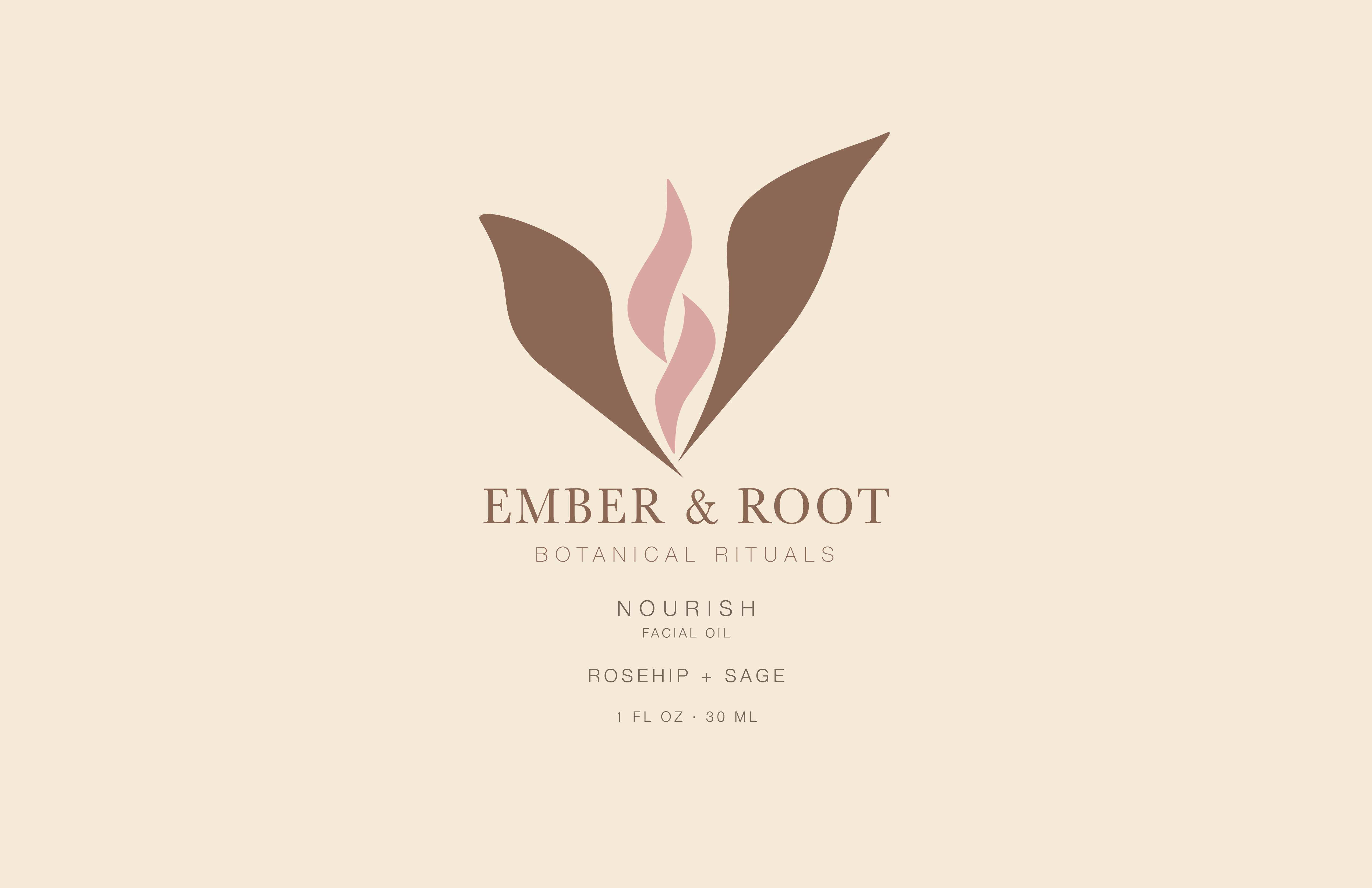
Color Palette
03 / COLORBrand Applications
04 / MOCKUPS
Nourish
Facial oil concept

Slow Morning
Candle concept

Branded Tote
Packaging and brand application
Final Presentation
05 / PRESENTATIONThe original brand identity presentation brings the visual direction together through the logo, color palette, and supporting design exploration.


Design with Intention.
EMBER & ROOT · BRAND IDENTITY